© Squizard Graphic Design 2021


© Squizard Graphic Design 2021
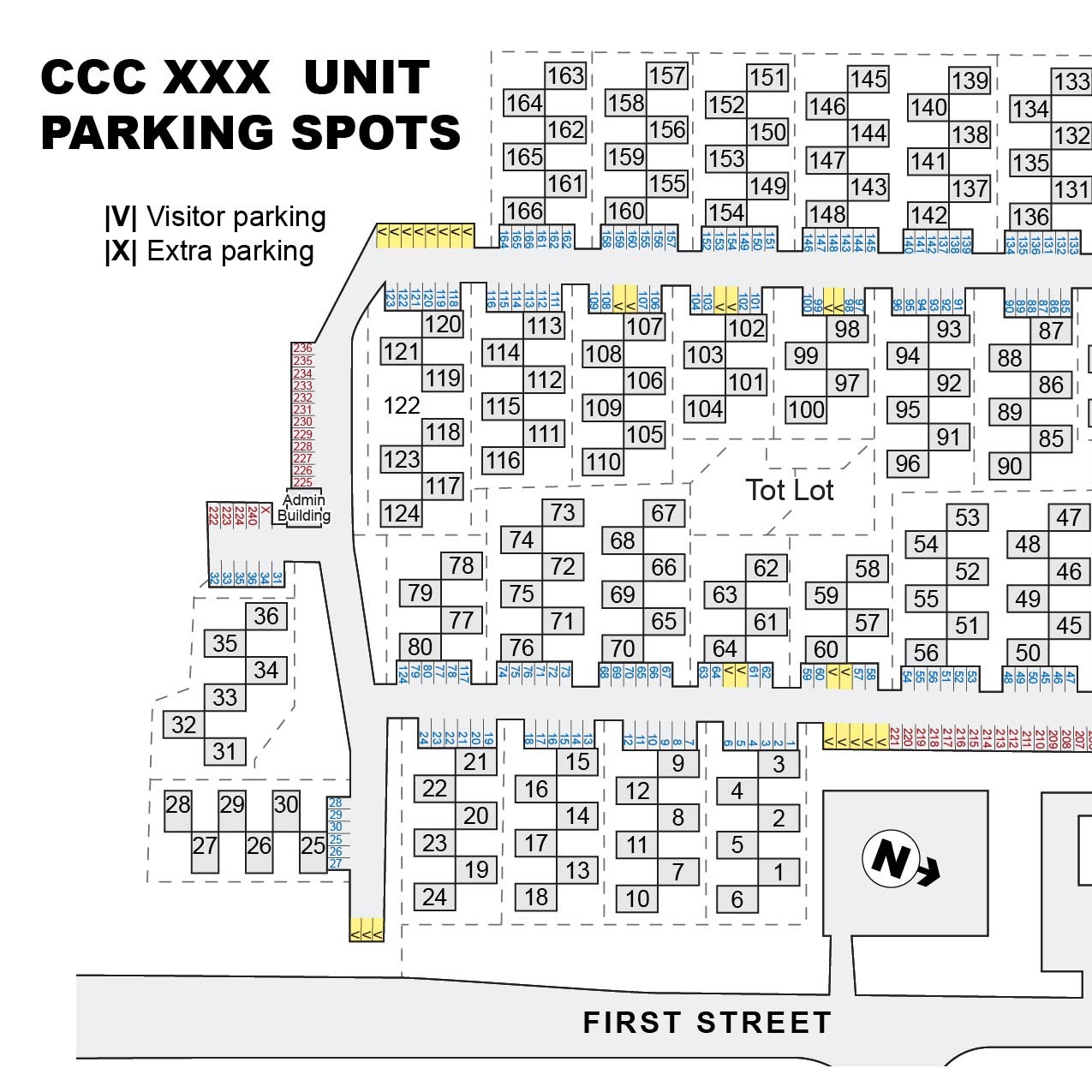
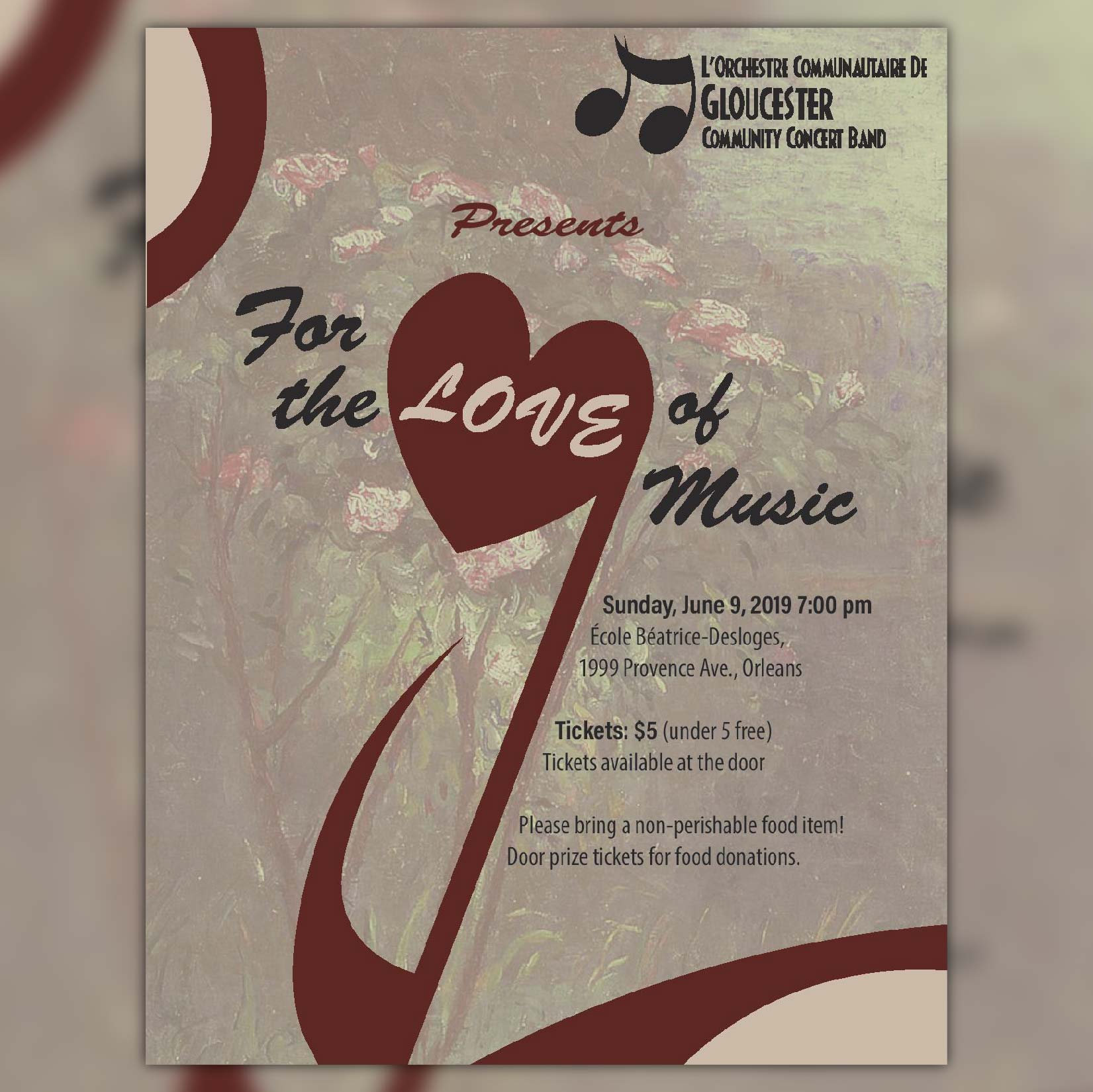


© Squizard Graphic Design 2021
© Squizard Graphic Design 2021

© Squizard Graphic Design 2021
Squizard Graphic Design offers graphic and web design services to Ottawa businesses and non-profits. Services that I offer include designing logos, posters, banners, signs, front end for websites and video editing. I have four years of graphic design experience and am committed to completing my client’s work in a timely and thorough manner.
Are you a charity or non-profit group? I may be willing to volunteer my services (situation-dependent).
Name: Aya Tessier
Age: 18
Studying: Astrophysics at Carleton University
Likes: Astronomy, volleyball and D&D
© Squizard Graphic Design 2021
hi
Contact me using the links below.


